British Council
2020
Serving as an in-house designer for the British Council, I presented a concept for a visual identity overhaul of their global Festivals and Seasons events. I was tasked with creating a fresh approach which was captivating for a younger audience.
Serving as an in-house designer for the British Council, I presented a concept for a visual identity overhaul of their global Festivals and Seasons events. I was tasked with creating a fresh approach which was captivating for a younger audience.
Serving as an in-house designer for the British Council, I presented a concept for a visual identity overhaul of their global Festivals and Seasons events. I was tasked with creating a fresh approach which was captivating for a younger audience.
I developed a complete approach which felt more dynamic, exciting, and with interchangeable components for new, but connected identities year-on-year.
Services
Visual identity
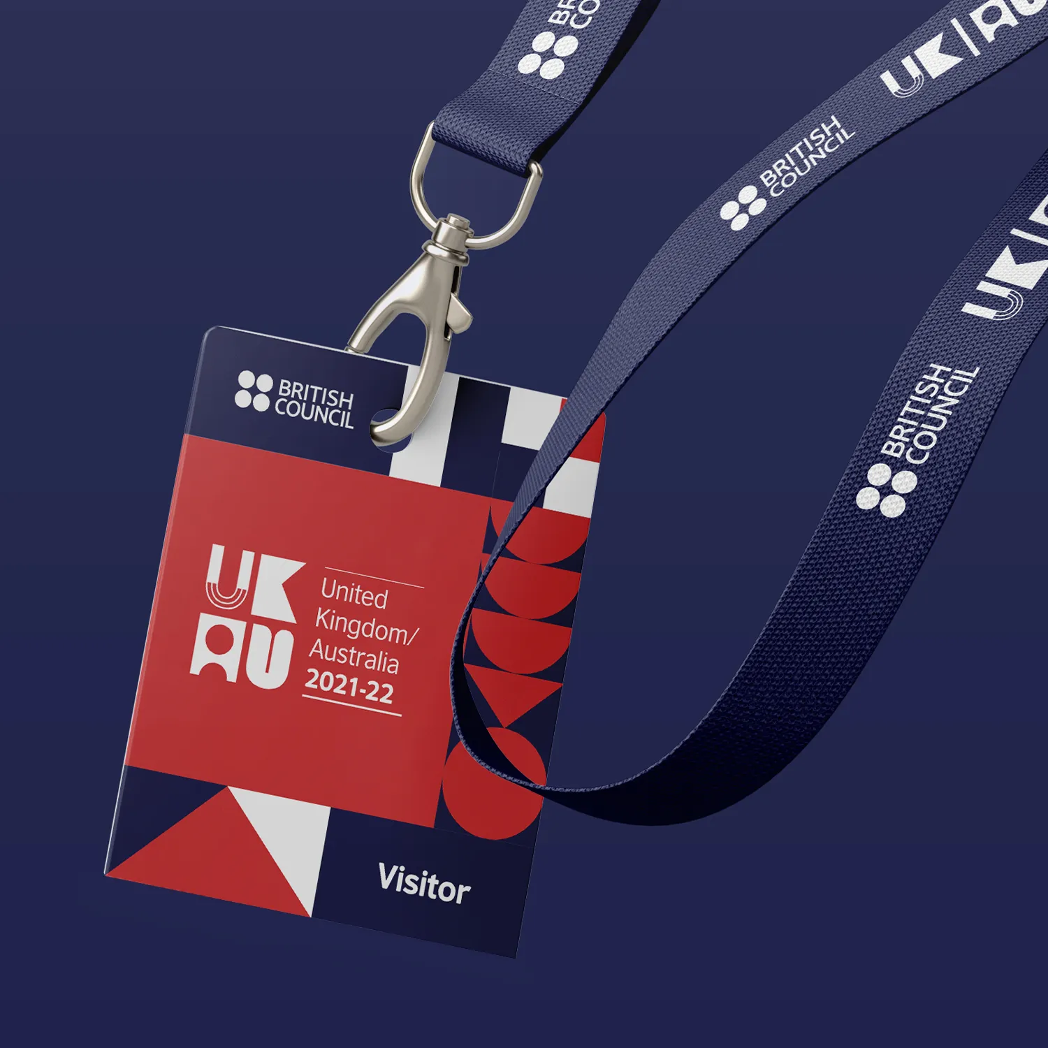
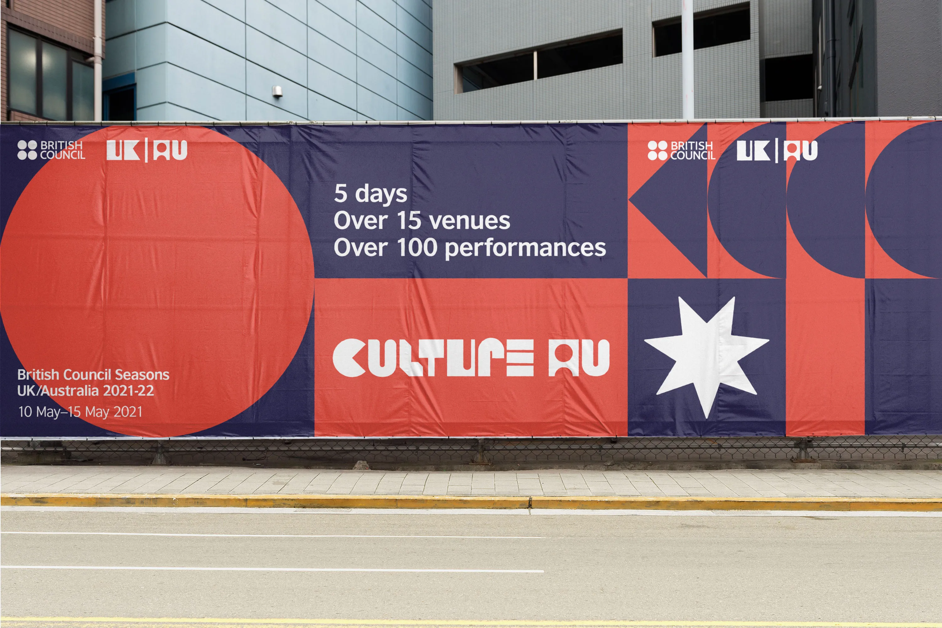
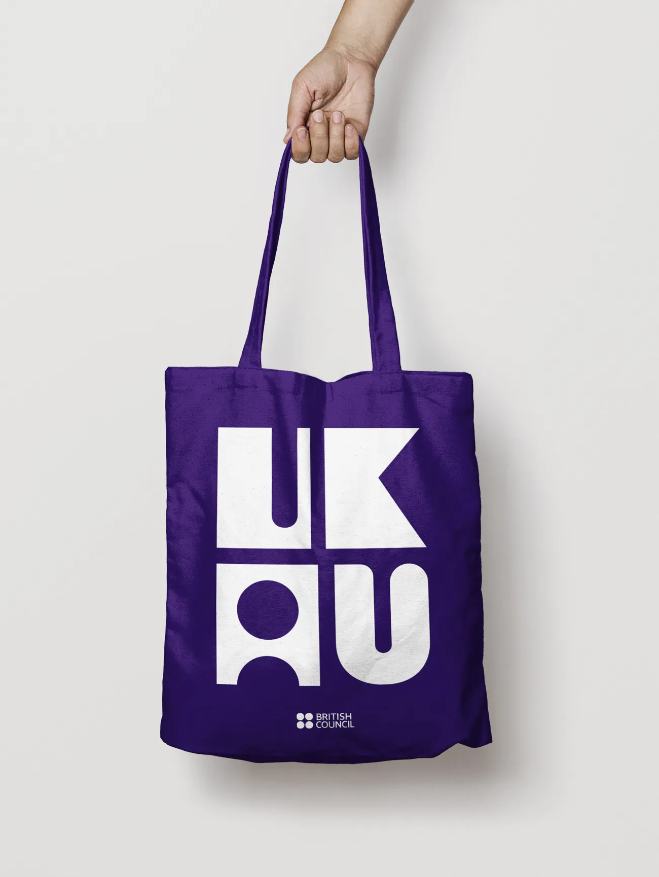
As the British Council has a robust visual language that all communications must utilise, I developed a modular system that worked alongside it.
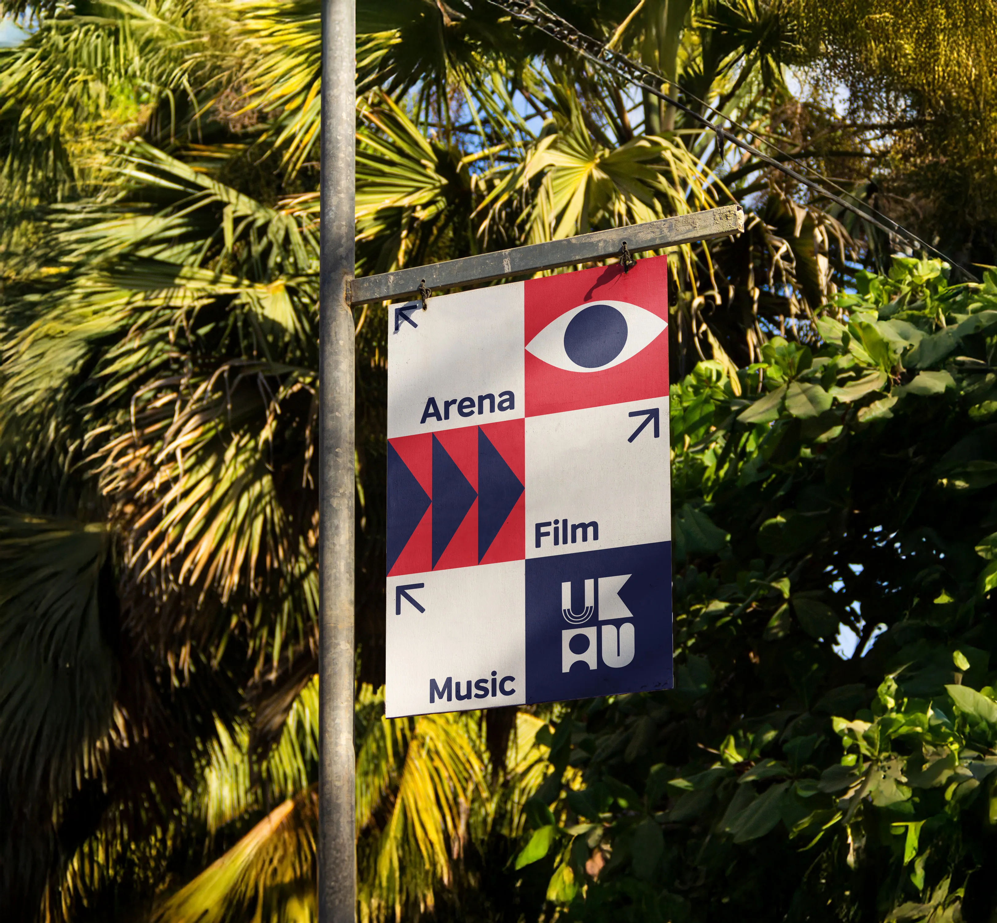
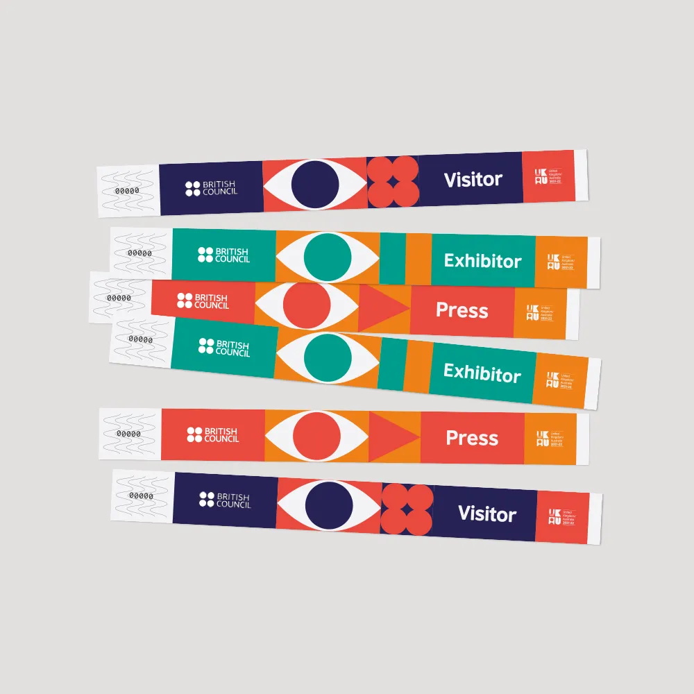
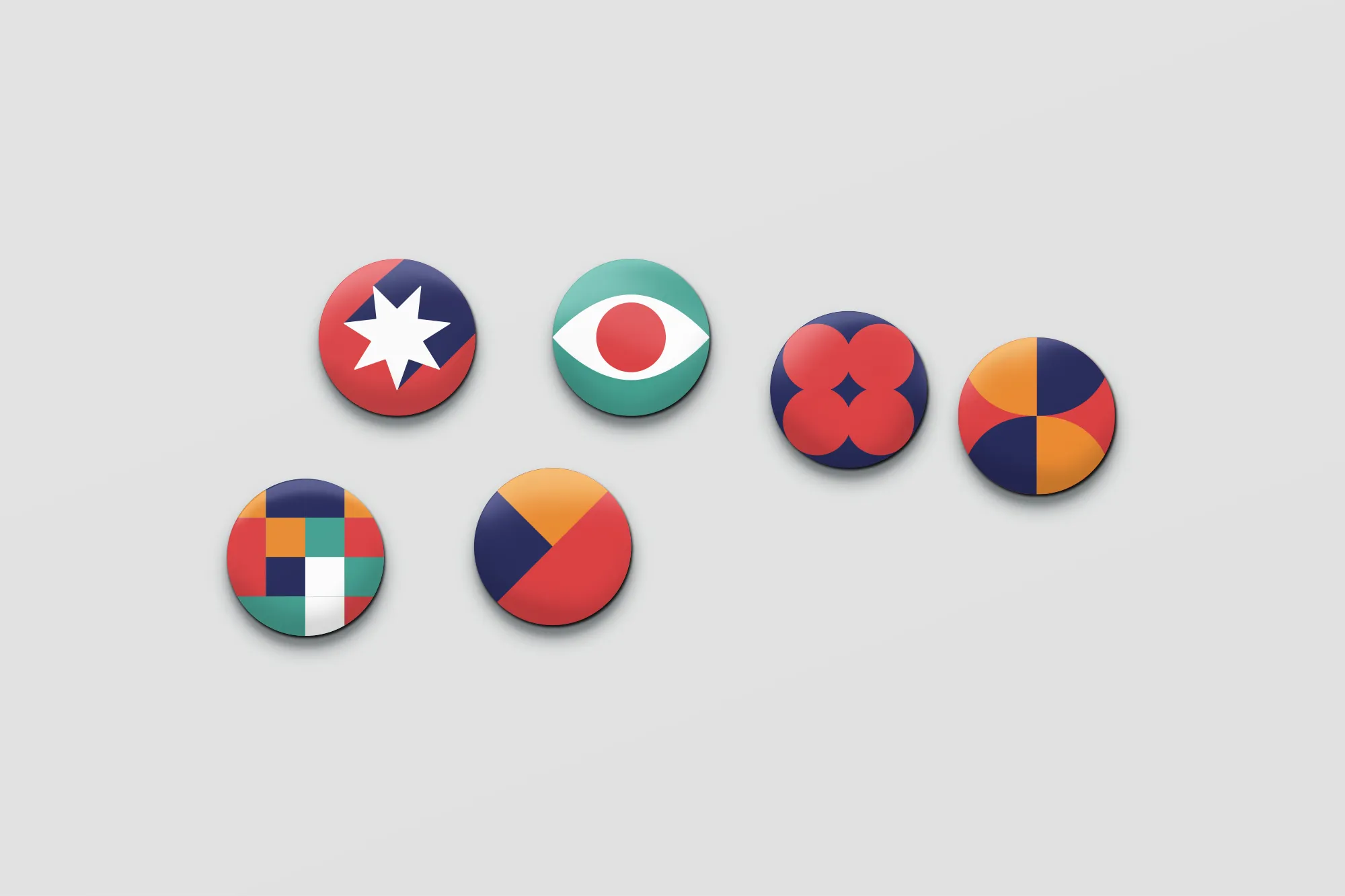
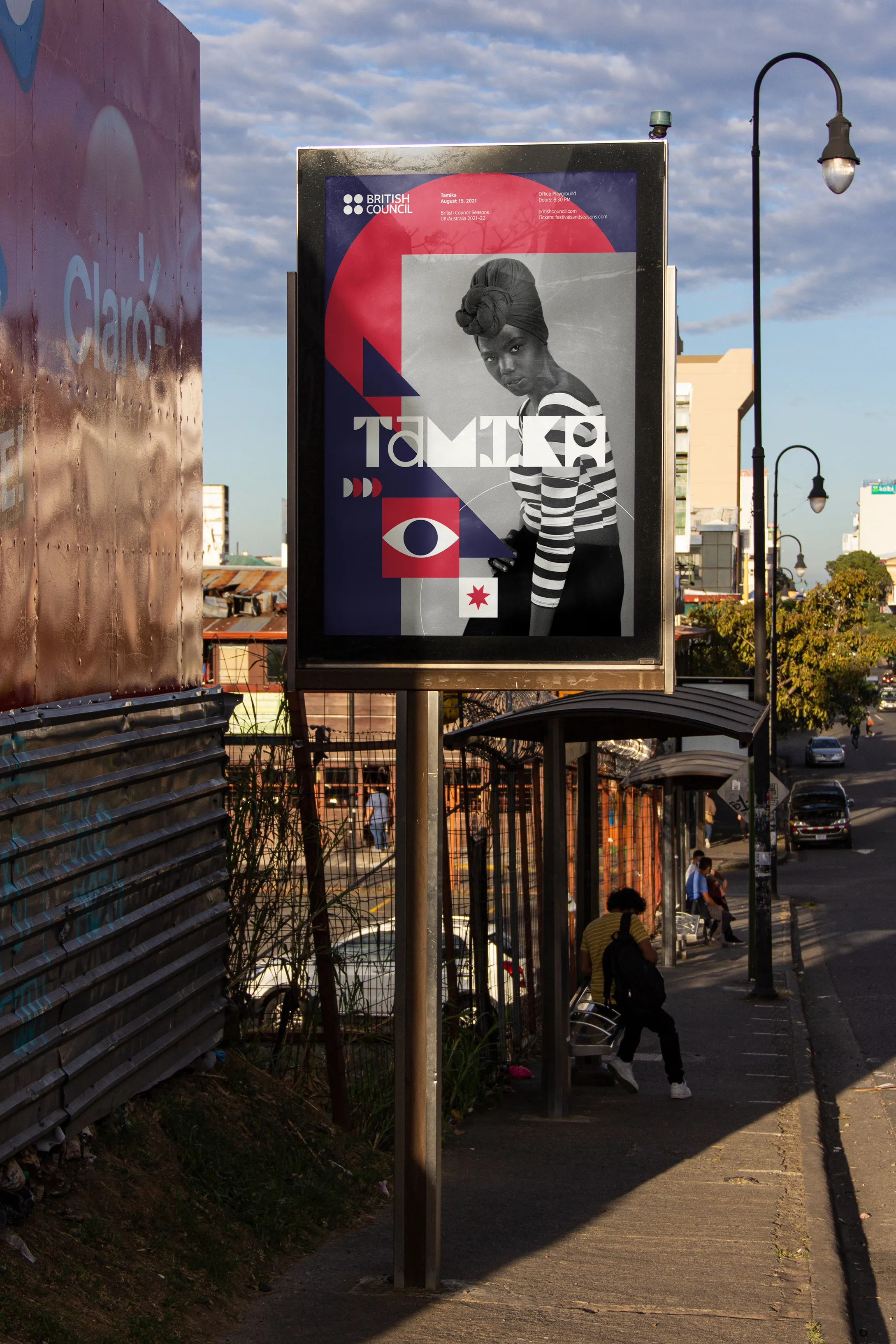
Using blocks of space based around the brand's layout rules gave me more space to be creative. I developed graphics based on festival relevant motifs such as sight, sound, and movement. This could also be expanded to visually relevant iconography of the place where the festival was being set. In this instance, the star from the Australian flag.
As the British Council has a robust visual language that all communications must utilise, I developed a modular system that worked alongside it.
Using blocks of space based around the brand's layout rules gave me more space to be creative. I developed graphics based on festival relevant motifs such as sight, sound, and movement. This could also be expanded to visually relevant iconography of the place where the festival was being set. In this instance, the star from the Australian flag.
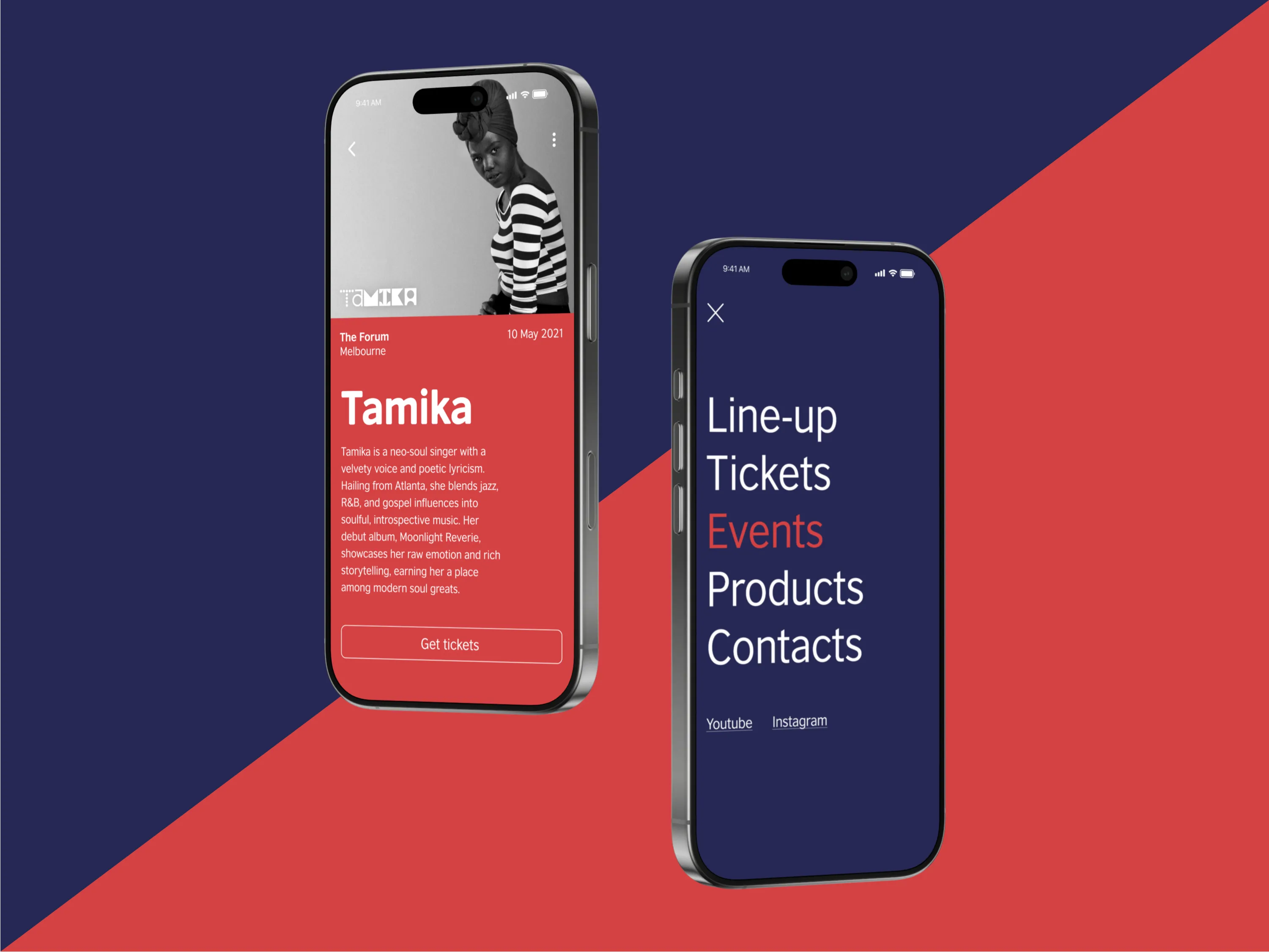
As a challenge, but something applicable to this project, I set about designing a bespoke typeface. This would not only act a communicative tool, but also as a distinct visual element for the events themselves.
To be usable and fit within the modular system, I developed a typeface that was blocky and mirrored the simple shapes (circles and squares) around which the visual identity was built upon.

British Council
2020
Serving as an in-house designer for the British Council, I presented a concept for a visual identity overhaul of their global Festivals and Seasons events. I was tasked with creating a fresh approach which was captivating for a younger audience.
I developed a complete approach which felt more dynamic, exciting, and with interchangeable components for new, but connected identities year-on-year.
Services
Visual identity
As the British Council has a robust visual language that all communications must utilise, I developed a modular system that worked alongside it.
Using blocks of space based around the brand's layout rules gave me more space to be creative. I developed graphics based on festival relevant motifs such as sight, sound, and movement. This could also be expanded to visually relevant iconography of the place where the festival was being set. In this instance, the star from the Australian flag.
As a challenge, but something applicable to this project, I set about designing a bespoke typeface. This would not only act a communicative tool, but also as a distinct visual element for the events themselves.
To be usable and fit within the modular system, I developed a typeface that was blocky and mirrored the simple shapes (circles and squares) around which the visual identity was built upon.