Hardass Ceramics
2024
Hardass is a naughty ceramics brand based in Amsterdam that aims to subvert conventions surrounding kink with playful pieces and clever tone of voice.
Hardass is a naughty ceramics brand based in Amsterdam that aims to subvert conventions surrounding kink with playful pieces and clever tone of voice.
Hardass is a naughty ceramics brand based in Amsterdam that aims to subvert conventions surrounding kink with playful pieces and clever tone of voice.
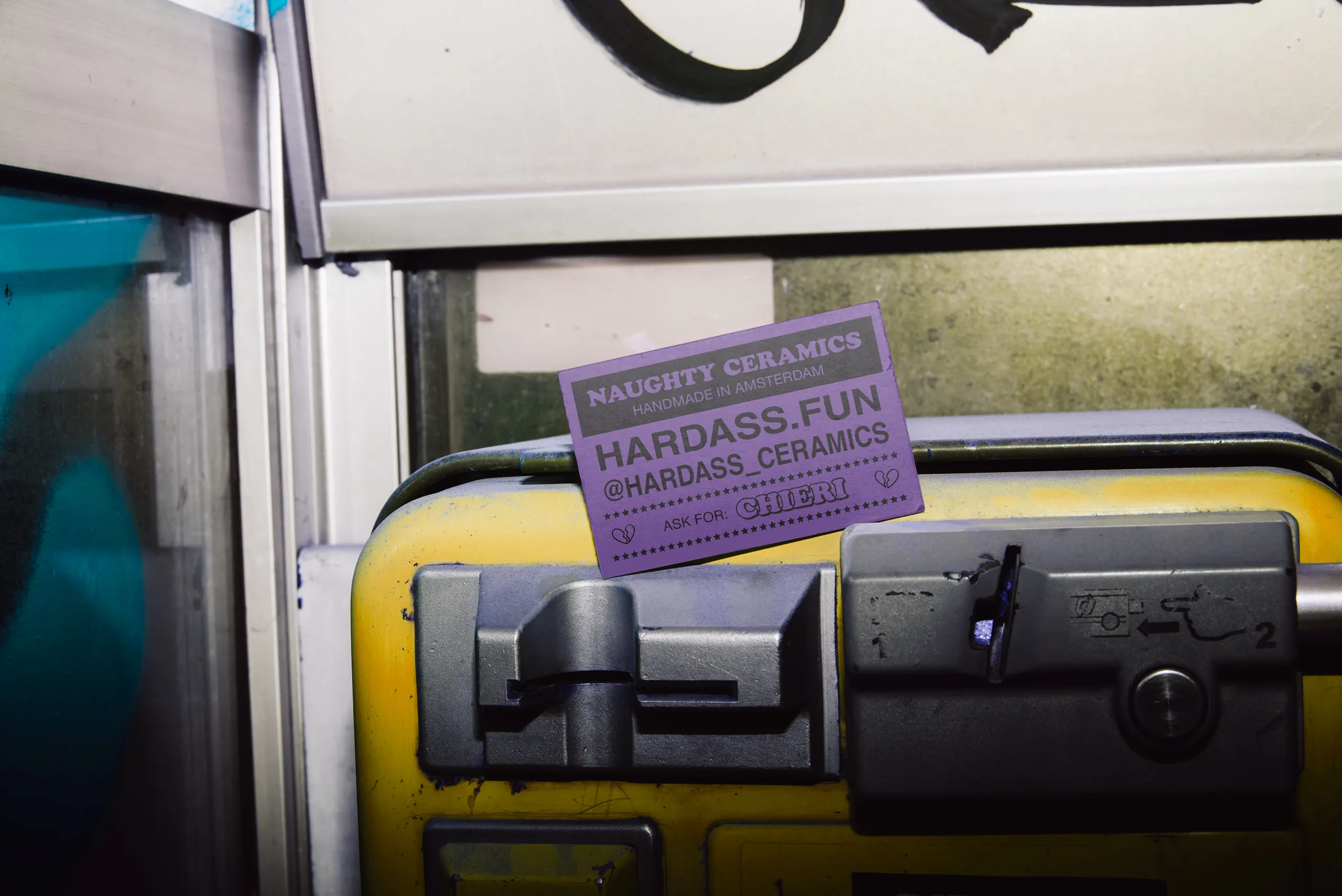
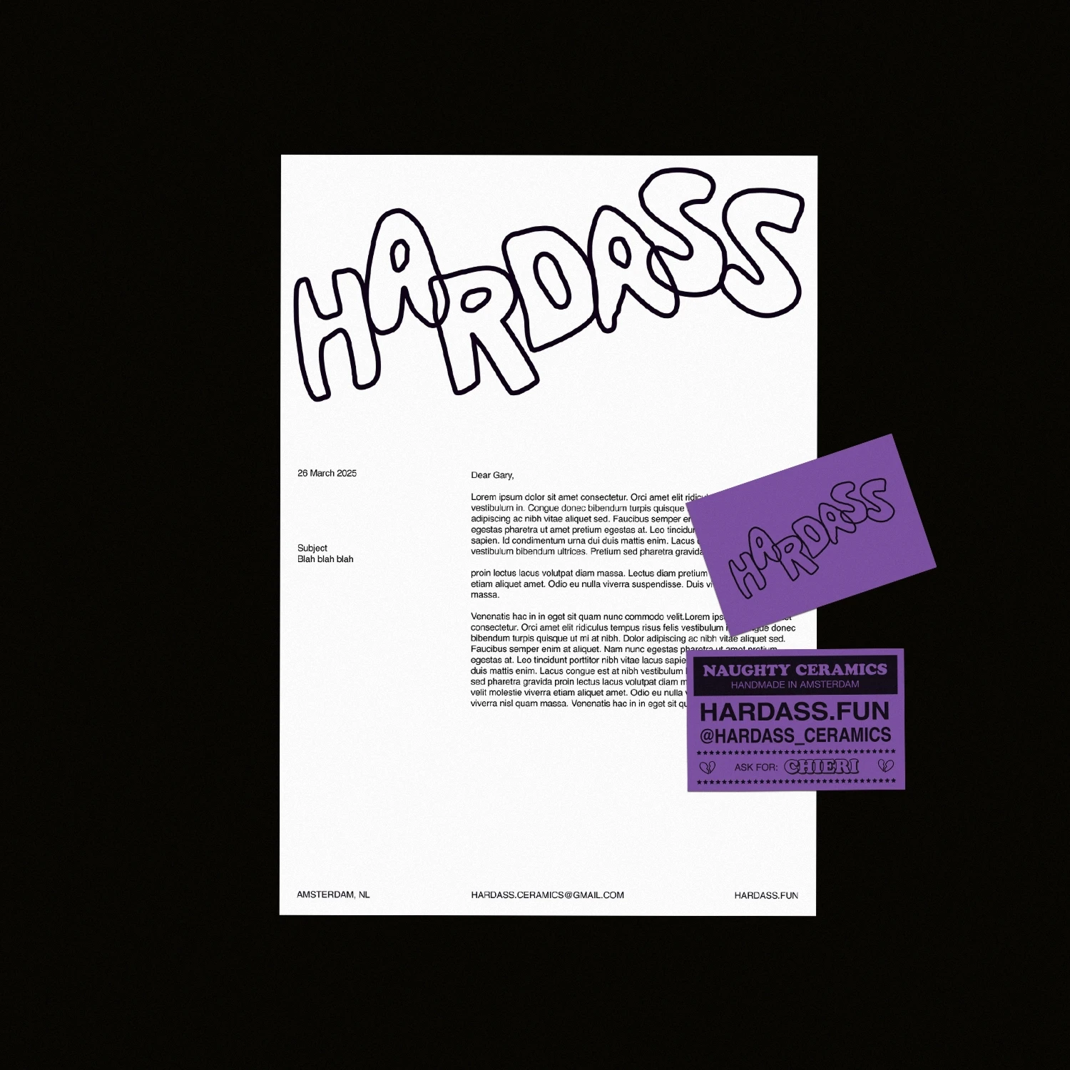
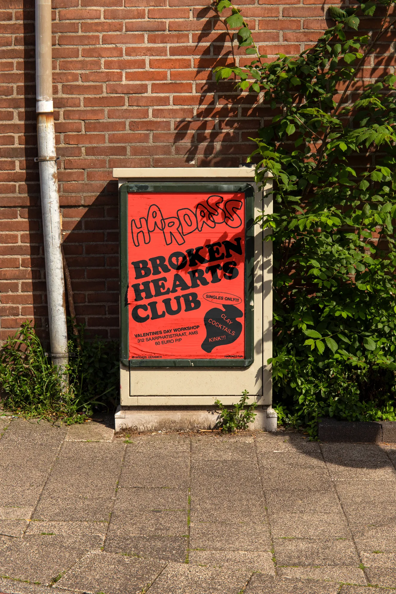
We wanted an identity that mirrored the artist's work, embracing its idiosyncrasies and shunning perfection for something that felt looser – with a small set of rules to help with continuity. Inspired by tart cards and the graphic design used in adult materials (wink wink), we drove for a bold, grungy approach that defied competitor approaches that prefer to utilise more 'cutesy' design choices.
Services
Brand identity
Brand strategy
Web design
Team
Chieri Higa

The wordmark is intentionally crude and is implemented as big as possible across all touchpoints.
The colour palette consists of bold primary colours to be used one at a time with black. This two-colour approach, whilst limiting, does give Hardass a distinct presence, as well as referencing its naughty influences.

A bespoke illustration set helped provide texture to the design assets as well as underpinning the brand's personality. I felt the best approach for this was to have the artist pen the illustrations herself. This decision not only helped develop her stake in the visual identity as a one-person business, but also added a level of personality to the brand that is completely unique.
The main deliverable to develop was an e-commerce website. We wanted a site that had wasn't overly slick, did not compromise usability and could be easily updated.
Developed in Framer, the end product is fully responsive and features the identity in full working order. The site has scalability in mind and will last a considerable time without wholesale changes.


Hardass Ceramics
2024
Hardass is a naughty ceramics brand based in Amsterdam that aims to subvert conventions surrounding kink with playful pieces and clever tone of voice.
We wanted an identity that mirrored the artist's work, embracing its idiosyncrasies and shunning perfection for something that felt looser – with a small set of rules to help with continuity. Inspired by tart cards and the graphic design used in adult materials (wink wink), we drove for a bold, grungy approach that defied competitor approaches that prefer to utilise more 'cutesy' design choices.
Services
Brand identity
Brand strategy
Web design
Team
Chieri Higa
The wordmark is intentionally crude and is implemented as big as possible across all touchpoints.
The colour palette consists of bold primary colours to be used one at a time with black. This two-colour approach, whilst limiting, does give Hardass a distinct presence, as well as referencing its naughty influences.
A bespoke illustration set helped provide texture to the design assets as well as underpinning the brand's personality. I felt the best approach for this was to have the artist pen the illustrations herself. This decision not only helped develop her stake in the visual identity as a one-person business, but also added a level of personality to the brand that is completely unique.
The main deliverable to develop was an e-commerce website. We wanted a site that had wasn't overly slick, did not compromise usability and could be easily updated.
Developed in Framer, the end product is fully responsive and features the identity in full working order. The site has scalability in mind and will last a considerable time without wholesale changes.